Chapter 16
Getting Straight Talk on Straight-Line Regression
IN THIS CHAPTER
 Determining when to use straight-line regression
Running a straight-line regression and making sense of the output
Examining results for issues and problems
Estimating needed sample size for straight-line regression
Chapter 15 refers to regression analyses in a general way. This chapter focuses on the simplest type of regression analysis: straight-line regression. You can visualize it as fitting a straight line to the points in a scatter plot from a set of data involving just two variables. Those two variables are generally referred to as X and Y. The X variable is formally called the independent variable (or the predictor or cause). The Y variable is called the dependent variable (or the outcome or effect).
Knowing When to Use Straight-Line Regression
 You may see straight-line regression referred to in books and articles by several different names, including linear regression, simple linear regression, linear univariate regression, and linear bivariate regression. This abundance of references can be confusing, so we always use the term straight-line regression.
 Straight-line regression is appropriate when all of these things are true:
- You’re interested in the relationship between two — and only two — numerical variables. At least one of them must be a continuous variable that serves as the dependent variable (Y).
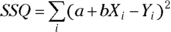
- You’ve made a scatter plot of the two variables and the data points seem to lie, more or less, along a straight line (as shown in Figures 16-1a and 16-1b). You shouldn’t try to fit a straight line to data that appears to lie along a curved line (as shown in Figures 16-1c and 16-1d).
- The data points appear to scatter randomly around the straight line over the entire range of the chart, with no extreme outliers (as shown in Figures 16-1a and 16-1b).

© John Wiley & Sons, Inc.
FIGURE 16-1: Straight-line regression is appropriate for both strong and weak linear relationships (a and b), but not for nonlinear (curved-line) relationships (c and d).
You should proceed with straight-line regression when one or more of the following are true:
- You want to test whether there’s a statistically significant association between the X and Y variables.
- You want to know the value of the slope and/or intercept (also referred to as the Y intercept) of a line fitted through the X and Y data points.
- You want to be able to predict the value of Y if you know the value of X.
Understanding the Basics of Straight-Line Regression
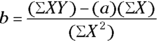
The formula of a straight line can be written like this:  . This formula breaks down this way:
- Y is the dependent variable (or outcome).
- X is the independent variable (or predictor).
- a is the intercept, which is the value of Y when
 .
. - b is the slope, which is the amount Y changes when X increases by 1.
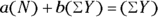
In straight-line regression, our goal is to develop the best-fitting line for our data. Using least-squares as a guide, the best-fitting line through a set of data is the one that minimizes the sum of the squares (SSQ) of the residuals. Residuals are the vertical distances of each point from the fitted line, as shown in Figure 16-2.

© John Wiley & Sons, Inc.
FIGURE 16-2: On average, a good-fitting line has smaller residuals than a bad-fitting line.
For curves, finding the best-fitting curve is a very complicated mathematical problem. What’s nice about the straight-line regression is that it’s so simple that you can calculate the least-squares parameters from explicit formulas. If you’re interested (or if your professor insists that you’re interested), we present a general outline of how those formulas are derived.
Think of a set of data containing  and
and  , in which i is an index that identifies each observation in the set, as described in Chapter 2. From those data, SSQ can be calculated like this:
If you’re good at first-semester calculus, you can find the values of a and b that minimize SSQ by setting the partial derivatives of SSQ with respect to a and b equal to 0. If you stink at calculus, trust that this leads to these two simultaneous equations:
where N is the number of observed data points.
These equations can be solved for a and b:
See Chapter 2 if you don’t feel comfortable reading the mathematical notations or expressions in this section.
Running a Straight-Line Regression
 Even if it is possible, it is not a good idea to calculate regressions manually or with a calculator. You’ll go crazy trying to evaluate all those summations and other calculations, and you’ll almost certainly make a mistake somewhere in your calculations.
Fortunately, most statistical packages can perform a straight-line regression. Microsoft Excel has built-in functions for calculating the slope and intercept of the least-squares straight line. You can also find straight-line regression web pages (several are listed at https://statpages.info). If you use R, you can explore using the lm() command. (See Chapter 4 for an introduction to statistical software.) In the following sections, we list the basic steps for running a straight-line regression, complete with an example.
Taking a few basic steps
The exact steps you take to run a straight-line regression depend on what software you’re using, but here’s the general approach:
Structure your data into the proper form.
Usually, the data consist of two columns of numbers, one representing the independent variable and the other representing the dependent variable.
Tell the software which variable is the independent variable and which one is the dependent variable.
Depending on the software, you may type in the variable names, or pick them from a menu or list in your file.
- If the software offers output options, tell it that you want it to output these results:
- Graphs of observed and calculated values
- Summaries and graphs of the residuals
- Regression table
- Goodness-of-fit measures
Execute the regression in the software (tell it to run the regression).
Then go look for the output. You should see the output you requested in Step 3.
Walking through an example
To see how to run a straight-line regression and interpret the output, we use the following example throughout the rest of this chapter.
Consider how blood pressure (BP) is related to body weight. It may be reasonable to suspect that people who weigh more have higher BP. If you test this hypothesis on people and find that there really is an association between weight and BP, you may want to quantify that relationship. Maybe you want to say that every extra kilogram of weight tends to be associated with a certain amount of increased BP. Even though you are testing an association, the reality is that you believe that as people weigh more, it causes their BP to go up — not the other way around. So, you would characterize weight as the independent variable (X), and BP as the dependent variable (Y). The following sections take you through the steps of gathering data, creating a scatter plot, and interpreting the results.
Gathering the data
Suppose that you recruit a sample of 20 adults from a particular clinical population to participate in your study (see Chapter 6 for more on sampling). You weigh them and measure their systolic BP (SBP) as a measure of their BP. Table 16-1 shows a sample of weight and SBP data from 20 participants. Weight is recorded in kilograms (kg), and SBP is recorded in the strange-sounding units of millimeters of mercury (mmHg).
TABLE 16-1 Weight and Blood Pressure Data
Participant Study ID |
Body Weight (kg) |
SBP (mmHg) |
|---|---|---|
1 |
74.4 |
109 |
2 |
85.1 |
114 |
3 |
78.3 |
94 |
4 |
77.2 |
109 |
5 |
63.8 |
104 |
6 |
77.9 |
132 |
7 |
78.9 |
127 |
8 |
60.9 |
98 |
9 |
75.6 |
126 |
10 |
74.5 |
126 |
11 |
82.2 |
116 |
12 |
99.8 |
121 |
13 |
78.0 |
111 |
14 |
71.8 |
116 |
15 |
90.2 |
115 |
16 |
105.4 |
133 |
17 |
100.4 |
128 |
18 |
80.9 |
128 |
19 |
81.8 |
105 |
20 |
109.0 |
127 |
Creating a scatter plot
It’s not easy to identify patterns and trends between weight and SBP by looking at a table like Table 16-1. You get a much clearer picture of how the data are related if you make a scatter plot. You would place weight, the independent variable, on the X axis, and SBP, the dependent variable, on the Y axis, as shown in Figure 16-3.

© John Wiley & Sons, Inc.
FIGURE 16-3: Scatter plot of SBP versus body weight.
Examining the results
In Figure 16-3, you can see the following pattern:
- Low-weight participants have lower SBP, which is represented by the points near the lower-left part of the graph.
- Higher-weight participants have higher SBP, which is represented by the points near the upper-right part of the graph.
You can also tell that there aren’t any higher-weight participants with a very low SBP, because the lower-right part of the graph is rather empty. But this relationship isn’t completely convincing, because several participants in the lower weight range of 70 to 80 kg have SBPs over 125 mmHg.
A correlation analysis (described in Chapter 15) will tell you how strong this type of association is, as well as its direction (which is positive in this case). The results of a correlation analysis help you decide whether or not the association is likely due to random fluctuations. Assuming it is not, proceeding to a regression analysis provides you with a mathematical formula that numerically expresses the relationship between the two variables (which are weight and SBP in this example).
Interpreting the Output of Straight-Line Regression
In the following sections, we walk you through the printed and graphical output of a typical straight-line regression run. Its looks will vary depending on your software. The output in this chapter was generated using R (see Chapter 4 to get started with R). But regardless of the software you use, you should be able to program the regression so the following elements appear on your output:
- A statement of what you asked the program to do (the code you ran for the regression)
- A summary of the residuals, including graphs that display the residuals and help you assess whether they’re normally distributed
- The regression table (providing the results of the regression model)
- Measures of goodness-of-fit of the line to the data
Seeing what you told the program to do
In the example data set, the SBP variable is named BPs, and the weight variable is named wgt. In Figure 16-4, the first two lines produced by the statistical software reprint the code you ran. The code says that you wanted to fit a linear formula where the software estimates the parameters to the equation SBP = weight based on your observed SBP and weight values. The code used was lm(formula = BPs ~ Wgt).

FIGURE 16-4: Sample straight-line regression output from R.
The actual equation of the straight line is not SBP = weight, but more accurately SBP = a + b × weight, with the a (intercept) and b (slope) parameters having been left out of the model. This is a reminder that although the goal is to evaluate the SBP = weight model conceptually, in reality, this relationship will be numerically different with each data set we use.
Evaluating residuals
The residual for a point is the vertical distance of that point from the fitted line. It’s calculated as  , where a and b are the intercept and slope of the fitted straight line, respectively.
Most regression software outputs several measures of how the data points scatter above and below the fitted line, which provides an idea of the size of the residuals (see “Summary statistics for the residuals” for how to interpret these measures). The residuals for the sample data are shown in Figure 16-5.

© John Wiley & Sons, Inc.
FIGURE 16-5: Scattergram of SBP versus weight, with the fitted straight line and the residuals of each point from the line.
Summary statistics for the residuals
If you read about summarizing data in Chapter 9, you know that the distribution of values from a numerical variable are reported using summary statistics, such as mean, standard deviation, median, minimum, maximum, and quartiles. Summary statistics for residuals are what you should expect to find in the residuals section of your software’s output. Here’s what you see in Figure 16-4 at the top under Residuals:
- The minimum and maximum values: These are labeled as Min and Max, respectively, and represent the two largest residuals, or the two points that lie farthest away from the least-squares line in either direction. The minimum is negative, indicating it is below the line, while the positive maximum is above the line. The minimum is almost 21 mmHg below the line, while the maximum lies about 17 mmHg above the line.
- The first and third quartiles: These are labeled IQ and 3Q on the output. Looking under IQ, which is the first quartile, you can tell that about 25 percent of the data points (which would be 5 out of 20) lie more than 4.7 mmHg below the fitted line. For the third quartile results, you see that another 25 percent lie more than 6.5 mmHg above the fitted line. The remaining 50 percent of the points lie within those two quartiles.
- The median: Labeled Median on the output, a median of –3.4 tells you that half of the residuals, which is 10 of the 20 data points, are less than –3.4, and half are greater than –3.4. The negative sign means the median lies below the fitted line.
Note: The mean isn’t included in these summary statistics because the mean of the residuals is always exactly 0 for any kind of regression that includes an intercept term.
The residual standard error, often called the root-mean-square (RMS) error in regression output, is a measure of how tightly or loosely the points scatter above or below the fitted line. You can think of it as the standard deviation (SD) of the residuals, although it’s computed in a slightly different way from the usual SD of a set of numbers. RMS uses  instead of
  in the denominator of the SD formula. At the bottom of Figure 16-4, Residual standard error is expressed as 9.838 mmHg. You can think of it as another summary statistic for residuals
Graphs of the residuals
Most regression programs will produce different graphs of the residuals if requested in code. You can use these graphs to assess whether the data meet the criteria for executing a least-squares straight-line regression. Figure 16-6 shows two of the more common types of residual graphs. The one on the left is called a residuals versus fitted graph, and the one on the right is called a normal Q-Q graph.

© John Wiley & Sons, Inc.
FIGURE 16-6: The residuals versus fitted (a) and normal (b) Q-Q graphs help you determine whether your data meets the requirements for straight-line regression.
As stated at the beginning of this section, you calculate the residual for each point by subtracting the predicted Y from the observed Y. As shown in Figure 16-6, a residuals versus fitted graph displays the values of the residuals plotted along the Y axis and the predicted Y values from the fitted straight line plotted along the X axis. A normal Q-Q graph shows the standardized residuals, which are the residuals divided by the RMS value, along the Y axis, and theoretical quantiles along the X axis. Theoretical quantiles are what you’d expect the standardized residuals to be if they were exactly normally distributed.
Together, the two graphs shown in Figure 16-6 provide insight into whether your data conforms to the requirements for straight-line regression:
- Your data must lie above and below the line randomly across the whole range of data.
- The average amount of scatter must be fairly constant across the whole range of data.
- The residuals should be approximately normally distributed.
You need years of experience examining residual plots before you can interpret them confidently, so don’t feel discouraged if you can’t tell whether your data complies with the requirements for straight-line regression from these graphs. Here’s how we interpret them, allowing for other biostatisticians to disagree:
- We read the residuals versus fitted chart in Figure 16-6 to show the points lying equally above and below the fitted line, because this appears true whether you’re looking at the left, middle, or right part of the graph.
- Figure 18-6 shows most of the residuals lie within
 mmHg of the line, but several larger residuals appear to be where the SBP is around 115 mmHg. We think this is a little suspicious. If you see a pattern like this, you should examine your raw data to see whether there are unusual values associated with these particular participants.
 - If the residuals are normally distributed, then in the normal Q-Q chart in Figure 16-6, the points should lie close to the dotted diagonal line, and shouldn’t display any overall curved shape. Our opinion is that the points follow the dotted line pretty well, so we’re not concerned about lack of normality in the residuals.
Making your way through the regression table
When doing regression, it is common to focus on the table of regression coefficients. It’s likely where you look first when interpreting your results, and where you concentrate most of your attention. When you run a straight-line regression, statistical programs typically produce a table of regression coefficients that looks much like the one in Figure 16-4 under the heading Coefficients.
For straight-line regression, the coefficients table has two rows that correspond with the two parameters of the straight line:
- The intercept row: This row is labeled (Intercept) in Figure 16-4, but can be labeled Intercept or Constant in other software.
- The slope row: This row is usually labeled with the name of the independent variable in your data, so in Figure 16-4, it is named Wgt. It may be labeled Slope in some programs.
The table has several different columns, depending on the software. In Figure 16-4, the columns are Estimate, Std. Error, t value, and Pr (>|t|). How to interpret the results from these columns is discussed in the next section.
The values of the coefficients (the intercept and the slope)
The first column of the table of regression coefficients usually shows the values of the slope and intercept of the fitted straight line (labeled Estimate in Figure 16-4). Other column headings include Coefficient or the single letter B or C (in uppercase or lowercase), depending on the software.
Looking at the rows in Figure 16-4, the intercept (labeled (Intercept)) is the predicted value of Y when X is equal to 0, and is expressed in the same units of measurement as the Y variable. The slope (labeled Wgt) is the amount the predicted value of Y changes when X increases by exactly one unit of measurement, and is expressed in units equal to the units of Y divided by the units of X.
In the example shown in Figure 16-4, the estimated value of the intercept is 76.8602 mmHg, and the estimated value of the slope is 0.4871 mmHg/kg.
- The intercept value of 76.9 mmHg means that a person who weighs 0 kg is predicted to have a SBP of about 77 mmHg. But nobody weighs 0 kg! The intercept in this example (and in many straight-line relationships in biology) has no physiological meaning at all, because 0 kg is completely outside the range of possible human weights.
- The slope value of 0.4871 mmHg/kg does have a real-world meaning. It means that every additional 1 kg of weight is associated with a 0.4871 mmHg increase in SBP. If we multiply both estimates by 10, we could say that every additional 10 kg of body weight is associated with almost a 5 mmHg SBP increase.
The standard errors of the coefficients
The second column in the regression table often contains the standard errors of the estimated parameters. In Figure 16-4, it is labeled Std. Error, but it could be stated as SE or use a similar term. We use SE to mean standard error for the rest of this chapter.
Because data from your sample always have random fluctuations, any estimate you calculate from your data will be subject to random fluctuations, whether it is a simple summary statistic or a regression coefficient. The SE of your estimate tells you how precisely you were able to estimate the parameter from your data, which is very important if you plan to use the value of the slope (or the intercept) in a subsequent calculation.
Keep these facts in mind about SE:
- SEs always have the same units as the coefficients themselves. In the example shown in Figure 16-4, the SE of the intercept has units of mmHg, and the SE of the slope has units of mmHg/kg.
Round off the estimated values. It is not helpful to report unnecessary digits. In this example, the SE of the intercept is about 14.7, so you can say that the estimate of the intercept in this regression is about
 mmHg. In the same way, you can say that the estimated slope is
  mmHg/kg.
When reporting regression coefficients in professional publications, you may state the SE like this: “The predicted increase in systolic blood pressure with weight (±1 SE) was
 mmHg/kg.”
If you know the value of the SE, you can easily calculate a confidence interval (CI) around the estimate (see Chapter 10 for more information on CIs). These expressions provide a very good approximation of the 95 percent confidence limits (abbreviated CL), which mark the low and high ends of the CI around a regression coefficient:


More informally, these are written as  .
.
So, the 95 percent CI around the slope in our example is calculated as 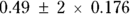 , which works out to
  , with the final confidence limits of 0.14 to 0.84 mmHg. If you submit a manuscript for publication, you may express the precision of the results in terms of CIs instead of SEs, like this: “The predicted increase in SBP as a function of body weight was 0.49 mmHg/kg
 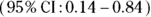 .”
.”
The Student t value
In most output, there is a column in the regression table that shows the ratio of the coefficient divided by its SE. This column is labeled t value in Figure 16-4, but it can be labeled t or other names. This column is not very useful. You can think of this column as an intermediate quantity in the calculation of what you’re really interested in, which is the p value for the coefficient.
The p value
A column in the regression tables (usually the last one) contains the p value, which indicates whether the regression coefficient is statistically significantly different from 0. In Figure 16-4, it is labeled  , but it can be called a variety of other names, including p value, p, and Signif.
In Figure 16-4, the p value for the intercept is shown as  , which is equal to 0.0000549 (see the description of scientific notation in Chapter 2). Assuming we set α at 0.05, the p value is much less than 0.05, so the intercept is statistically significantly different from zero. But recall that in this example (and usually in straight-line regression), the intercept doesn’t have any real-world importance. It’s equals the estimated SBP for a person who weighs 0 kg, which is nonsensical, so you probably don’t care whether it’s statistically significantly different from zero or not.
But the p value for the slope is very important. Assuming α = 0.05, if it’s less than 0.05, it means that the slope of the fitted straight line is statistically significantly different from zero. This means that the X and Y variables are statistically significantly associated with each other. A p value greater than 0.05 would indicate that the true slope could equal zero, and there would be no conclusive evidence for a statistically significant association between X and Y. In Figure 18-4, the p value for the slope is 0.0127, which means that the slope is statistically significantly different from zero. This tells you that in your model, body weight is statistically significantly associated with SBP.
If you want to test for a significant correlation between two variables at α = 05, you can look at the p value for the slope of the least-squares straight line. If it’s less than 0.05, then the X and Y variables are also statistically significantly correlated. The p value for the significance of the slope in a straight-line regression is always exactly the same as the p value for the correlation test of whether r is statistically significantly different from zero, as described in Chapter 15.
Wrapping up with measures of goodness-of-fit
The last few lines of output in Figure 16-4 contain several indicators of how well the straight line represents the data. The following sections describe this part of the output.
The correlation coefficient
Most straight-line regression programs provide the classic Pearson r correlation coefficient between X and Y (see Chapter 15 for details). But the program may provide you the correlation coefficient in a roundabout way by outputting  rather than r itself. In Figure 16-4, at the bottom under Multiple R-squared, the
  is listed as 0.2984. If you want Pearson r, just use Microsoft Excel or a calculator to take square root of 0.2984 to get 0.546.
The  is always positive, because square of any number is always positive. But the correlation coefficient can be positive or negative, depending on whether the fitted line slopes upward or downward. If the fitted line slopes downward, make your r value negative.
Why did the program give you  instead of r in the first place? It’s because
  is a useful estimate called the coefficient of determination. It tells you what percent of the total variability in the Y variable can be explained by the fitted line.
- An
 value of 1 means that the points lie exactly on the fitted line, with no scatter at all.
 - An
 value of 0 means that your data points are all over the place, with no tendency at all for the X and Y variables to be associated.
 - An
 value of 0.3 (as in this example) means that 30 percent of the variance in the dependent variable is explainable by the independent variable in this straight-line model.
Note:Figure 18-4 also lists the Adjusted R-squared at the bottom right. We talk about the adjusted  value in Chapter 17 when we explain multiple regression, so for now, you can just ignore it.
The F statistic
The last line of the sample output in Figure 17-4 presents the F statistic and associated p value (under F-statistic). These estimates address this question: Is the straight-line model any good at all? In other words, how much better is the straight-line model, which contains an intercept and a predictor variable, at predicting the outcome compared to the null model?
The null model is a model that contains only a single parameter representing a constant term with no predictor variables at all. In this case, the null model would only include the intercept.
Under α = 0.05, if the p value associated with the F statistic is less than 0.05, then adding the predictor variable to the model makes it statistically significantly better at predicting SBP than the null model.
For this example, the p value of the F statistic is 0.013, which is statistically significant. It means using weight as a predictor of SBP is statistically significantly better than just guessing that everyone in the data set has the mean SBP (which is how the null model is compared).
Scientific fortune-telling with the prediction formula
As we describe in Chapter 15, one reason to do regression in biostatistics is to develop a prediction formula that allows you to make an educated guess about value of a dependent variable if you know the values of the independent variables. You are essentially developing a predictive model.
Some statistics programs show the actual equation of the best-fitting straight line. If yours doesn’t, don’t worry. Just substitute the coefficients of the intercept and slope for a and b in the straight-line equation:  .
.
With the output shown in Figure 16-4, where the intercept (a) is 76.9 and the slope (b) is 0.487, you can write the equation of the fitted straight line like this: SBP = 76.9 + 0.487 Weight.
Then you can use this equation to predict someone’s SBP if you know their weight. So, if a person weighs 100 kilograms, you can estimate that that person’s SBP will be around  , which is
  , or about 125.6 mmHg. Your prediction probably won’t be exactly on the nose, but it should be better than not using a predictive model and just guessing.
How far off will your prediction be? The residual SE provides a unit of measurement to answer this question. As we explain in the earlier section “Summary statistics for the residuals,” the residual SE indicates how much the individual points tend to scatter above and below the fitted line. For the SBP example, this number is  , so you can expect your prediction to be within about
  mmHg most of the time.
Recognizing What Can Go Wrong with Straight-Line Regression
Fitting a straight line to a set of data is a relatively simple task, but you still have to be careful. A computer program does whatever you tell it to, even if it’s something you shouldn’t do.
Those new to straight-line regression may slip up in the following ways:
- Fitting a straight line to curved data: Examining the pattern of residuals in the residuals versus fitted chart in Figure 16-5 can let you know if you have this problem.
Ignoring outliers in the data: Outliers — especially those in the corners of a scatterplot like the one in Figure 16-3 — can mess up all the classical statistical analyses, and regression is no exception. One or two data points that are way off the main trend of the points will drag the fitted line away from the other points. That’s because the strength with which each point tugs at the fitted line is proportionate to the square of its distance from the line, and outliers have a lot of distance, so they have a strong influence.
Always look at a scatter plot of your data to make sure outliers aren’t present. Examine the residuals to ensure they are distributed normally above and below the fitted line.
Calculating the Sample Size You Need
To estimate how many data points you need for a regression analysis, you need to first ask yourself why you’re doing the regression in the first place.
- Do you want to show that the two variables are statistically significantly associated? If so, you want to calculate the sample size required to achieve a certain statistical power for the significance test (see Chapter 3 for an introduction to statistical power).
- Do you want to estimate the value of the slope (or intercept) to within a certain margin of error? If so, you want to calculate the sample size required to achieve a certain precision in your estimate.
Testing the statistical significance of a slope is exactly equivalent to testing the statistical significance of a correlation coefficient, so the sample-size calculations are also the same for the two types of tests. If you haven’t already, check out Chapter 15, which contains guidance and formulas to estimate how many participants you need to test for any specified degree of correlation.
If you’re using regression to estimate the value of a regression coefficient — for example, the slope of the straight line — then the sample-size calculations become more complicated. The precision of the slope depends on several factors:
- The number of data points: More data points give you greater precision. SEs vary inversely with the square root of the sample size. Alternatively, the required sample size varies inversely with the square of the desired SE. So, if you quadruple the sample size, you cut the SE in half. This is a very important and generally applicable principle.
- Tightness of the fit of the observed points to the line: The closer the data points hug the line, the more precisely you can estimate the regression coefficients. The effect is directly proportional, in that twice as much Y-scatter of the points produces twice as large a SE in the coefficients.
- How the data points are distributed across the range of the X variable: This effect is hard to quantify, but in general, having the data points spread out evenly over the entire range of X produces more precision than having most of them clustered near the middle of the range.
Given these factors, how do you strategically design a study and gather data for a linear regression where you’re mainly interested in estimating a regression coefficient to within a certain precision? One practical approach is to first conduct a study that is small and underpowered, called a pilot study, to estimate the SE of the regression coefficient. Imagine you enroll 20 participants and measure them, then create a regression model. If you’re really lucky, the SE may be as small as you wanted, or even smaller, so you know if you conduct a larger study, you will have enough sample.
But the SE from a pilot study usually isn’t small enough (unless you’re a lot luckier that we’ve ever been). That’s when you can reach for the square-root law as a remedy! Follow these steps to calculate the total sample size you need to get the precision you want:
- Divide the SE that you got from your pilot study by the SE you want your full study to achieve.
- Take the square of this ratio.
- Multiply the square of the ratio by the sample size of your pilot study.
Imagine that you want to estimate the slope to a precision or SE of ±5. If a pilot study of 20 participants gives you a SE of ±8.4 units, then the ratio is  , which is 1.68. Squaring this ratio gives you 2.82, which tells you that to get an SE of 5, you need
  , or about 56 participants. And because we assume you took our advice, we’ll assume you’ve already recruited the first 20 participants for your pilot study. Now, you only have to recruit only another 36 participants to have a total of 56.
Admittedly, this estimation is only approximate. But it does give you at least a ballpark idea of how big your sample size needs to be to achieve the desired precision.